
Why Did Cracker Barrel Change Its Logo—and Why Did It Walk It Back?
- Why Did Cracker Barrel Change Its Logo—and Why Did It Walk It Back?
- 60-Second Timeline: What Changed and What Happened Next?
- What Exactly Changed in the Logo?
- Why Did Cracker Barrel Change the Logo in the First Place?
- Why the Logo Refresh Didn’t Stick: My Business Breakdown?
- The Checklist: 10 Questions I’d Ask Before Touching a Legacy Logo
- Final Take
- FAQs
Cracker Barrel introduced a simplified logo in August 2025 to modernize its visual identity and improve readability on highway billboards, but quickly reverted to the original design on August 26, 2025. The rapid reversal was driven by intense customer backlash, as loyal patrons argued the removal of the iconic “Old Timer” character made the brand feel generic and disconnected from its nostalgic roots.
The problem is they didn’t just change a mark. They nudged the emotional shorthand people use to recognize the brand—and that’s where things got loud.
Below, I’ll walk through what changed, why they likely did it, and why the company ended up backing off.
60-Second Timeline: What Changed and What Happened Next?
-
Aug. 21, 2025: Cracker Barrel’s new logo starts showing up publicly as part of a broader refresh.
-
Aug. 22–26: The reaction snowballs—especially among loyal customers who felt the new look was too generic and didn’t “feel” like Cracker Barrel.
-
Aug. 26, 2025: The company posts a clear message: the new logo is going away, and the “Old Timer” will remain.
-
Fall 2025: Executives frame the original intent as practical (visibility/clarity), not a grand reinvention—and the company pauses or cools parts of the broader makeover plan.
-
Late 2025 (earnings season): The logo episode is discussed as part of a bigger customer-trust and traffic problem the company has to rebuild from.
That’s the skeleton. Now let me explain the muscle and the nerves.
What Exactly Changed in the Logo?
Cracker Barrel’s classic identity is basically a single glance: the “Old Timer” character, the barrel vibe, and the “Old Country Store” feeling. It’s not just a logo—it’s a shortcut to nostalgia.
The simplified logo leaned much more minimal: the company name, pared down, with the folksy character element removed during the brief rollout. If you’ve ever driven off the highway, seen the sign, and immediately thought “Yep, Cracker Barrel,” you already understand why the old version worked. Minimal is tempting—especially when a logo maker-style approach pushes everything toward “clean and modern”—but legacy brands don’t get paid for being clean; they get paid for being unmistakable.
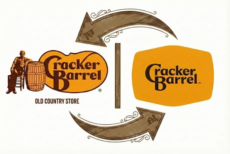
And that’s why the backlash made sense to me. When people said, “This doesn’t look like Cracker Barrel,” they weren’t nitpicking typography. They were reacting to a mismatch between what the brand promises and what the new symbol signals.
Why Did Cracker Barrel Change the Logo in the First Place?
If I strip away the internet noise, I think the motivation is pretty straightforward—and honestly, it’s a common problem for legacy brands.
Reason #1: Visibility (billboards + instant recognition)
A detailed logo can look great on a menu or a storefront… but fall apart when it has to be read at 70 mph or on a tiny phone screen.
Cracker Barrel leadership later emphasized something like: we wanted it to be more visible on highway billboards. That’s not a crazy goal. Clarity matters.
Reason #2: Modern consistency (digital/app/packaging)
Brands don’t live in one place anymore. A logo has to look decent:
-
on a mobile header
-
in a delivery app
-
on social avatars
-
on signage
-
on merch
Minimal logos are easy to deploy and hard to mess up.
Reason #3: Refreshing the brand without losing heritage
This is the classic tightrope walk: you want new customers without spooking the people who already love you. If your core audience is deeply loyal, any change can feel personal—especially when the brand is built on familiarity.
So yes: I understand why they tried it.
But I also understand why it didn’t stick.
Why the Logo Refresh Didn’t Stick: My Business Breakdown?
This is the part I care about most—because it’s the difference between “people didn’t like it” and “here’s why it became a business problem.”
Here’s my cleanest breakdown:
| What changed | What customers felt | Why it hurt (business) | What I would’ve done instead |
|---|---|---|---|
| A key recognition asset got removed (the “Old Timer” character element during the brief rollout) | “It doesn’t look like Cracker Barrel.” “I wouldn’t recognize it.” | Distinctiveness drops → the brand becomes easier to confuse and easier to replace. In a category full of options, that’s dangerous. | Keep the “Old Timer” as the anchor and modernize everything around it (cleaner lines, simplified lockup, flexible versions). |
| The vibe shifted toward “generic modern” | “The soul is gone.” “This could be any chain.” | Cracker Barrel sells a feeling as much as food. If the visual language stops matching the in-store promise, trust takes a hit. | Treat the refresh like interior design: evolve the vibe, don’t erase it. Make the “old country” warmth feel intentional, not outdated. |
| The rollout felt abrupt and under-explained | “Why are they changing this?” “Who asked for this?” | When the story is missing, people invent one. The conversation becomes about motive instead of improvement—and the company ends up spending goodwill to defend itself. | Roll it out in phases: test markets, show side-by-side comparisons, explain what’s staying the same, and give loyal customers a role in the transition. |
| The company had to reverse course fast | “They’re not listening.” “They’re panicking.” | A reversal can stop the bleeding—but it can also confirm the perception that the brand is unstable. | Plan for reversibility from day one: have a “heritage version,” a pilot plan, and a clear decision rule for continuing vs. pausing. |
If you want my honest take: the biggest “mistake” wasn’t the idea of modernization. It was underestimating that Cracker Barrel’s logo is a trust symbol, not a decoration.
Once the backlash became big enough, walking it back was almost inevitable. Keeping the new logo would’ve meant paying a long-term price in loyalty, traffic, and brand affection—especially when the company’s whole model leans on repeat customers and road-trip familiarity.
The Checklist: 10 Questions I’d Ask Before Touching a Legacy Logo
If you’re reading this as a marketer, founder, or brand operator, here’s the list I’d keep taped to my monitor:
Am I deleting a recognition asset people love?
Can someone recognize this in one second on a sign or phone screen?
Does the new look match the real customer experience?
Did I test this with real guests (not just internal opinions)?
Did I explain why now in plain language?
Did I clearly state what’s staying the same?
Do I have a phased rollout plan (pilot → expand → finalize)?
Do I have a reversal plan that doesn’t look like chaos?
Do staff members have a confident, consistent explanation?
What does “success” look like—and how will I measure it?
Final Take
Cracker Barrel didn’t change its logo because it hates its past. The business reason—clarity and modern consistency—makes sense.
But the brand’s identity is built on a specific promise: comfort, familiarity, and a kind of old-school warmth you can spot from the highway. When the visual cue stopped matching that promise, the reaction wasn’t just aesthetic—it was emotional.
My big lesson from this: Legacy brands can modernize, but they can’t genericize.
If you modernize in a way that makes people say “this could be any chain,” you’re not refreshing—you’re erasing.
FAQs
Why is the Cracker Barrel logo change controversial?
Because it briefly removed a heritage element many customers associate with the brand’s identity, and people felt the replacement looked too generic and didn’t match the “old country store” vibe.
Why would a company walk back a logo change so quickly?
Because pushing through can cost more than reversing if loyalty and traffic start to wobble.
Is it ever smart to remove a long-running character/mascot?
Only if the brand has other strong recognition assets to replace it. If the character is the anchor, removing it is high risk.
Did Cracker Barrel fire the person who changed the logo?
I haven’t seen the company publicly confirm a specific “we fired the logo person” story. What’s been reported more broadly is leadership and oversight changes in the wake of the backlash—different from a clear, named firing tied to the design itself.